How Branding Can Be Your Most Powerful Marketing Tool

A brand is a combination of building blocks that communicate your vision and value to your patients.
Your brand’s visual and written components should work in harmony to represent YOU. Your brand can shout, sing, or whisper your name to your audience; it can attract or repel them, intrigue or puzzle them. To that end, your brand wields a great deal of power – blending your logo, message, values, mission, goals, and design – to make your patients feel…and think of you specifically when they do.
The Visual Component
The visual component of a brand – color, images, and design – can be an effective way to capture an audience for many reasons. What individual people like and dislike is deeply ingrained; responses to these colors, images, and designs are the result of unique life experiences. Few people can explain their reactions to a given image, but the feelings tend to be immediate and strongly positive or negative.
We all have feelings about what we see. Whether we can verbalize those feelings or not, we remember the mood we feel from a color palette or logo and specific visual elements—whether it’s a tree, a water theme, a cleverly incorporated graphic of a tooth, or some other distinctive factor. Even if we don’t remember the name of a business immediately, we’re likely to recall the feelings elicited by specific colors, a design, or a logo.
The Written Component
The verbal and written components of a brand are just as important as the visual pieces because they reinforce and articulate the reactions brought about by the visual components. If your audience likes what they see from your visual brand, carefully selected words and ideas that reinforce your vision and goals will help solidify their impressions of your practice.
Wording is also very important because it gives you a chance to speak to your patient’s needs and earn their trust. When advertising (website content, direct mail, radio, print materials, etc.) speaks to the health, strength, comfort, and quality of life of your patients, it feels more trustworthy than a focus on surface concerns like physical appearance or cost. For example, if your mission states that you will treat patients like family, or that you hope to enjoy their smiles along with them, it helps patients see that you view them as a person and not a number.
Real-Life Brand Studies
Brand consistency reinforces the trust your patients have in you. You may currently have a brand but don’t feel it accurately represents you or feel that you need a refresh. After you and PDA ? Marketing Group work together to create or refresh your ideal brand, we intentionally include that brand across all the media we produce for your practice—from your ForeverSite™ to your direct mailers, to your stationery, swag, and beyond to help build that all important trust that patients demand.
Below are a few branding samples of PDA clients that represent how we can help turn your vision into a powerhouse brand that will jumpstart your success and speak to the hearts of your potential patients.
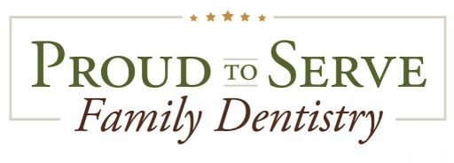
Proud to Serve Family Dentistry
The owner of Proud to Serve Family Dentistry comes from a military background that is very important to her. This is reflected in her practice logo that uses strong fonts and unisex colors that exude confidence. Including stars in her logo gives a subtle nod to military honors as well as an important element of the American flag. The five stars are also a nod to the universal star rating system and hint at a top-quality service and environment. Key brand words for Proud to Serve Family Dentistry are wellness, service, trust, assurance, and compassionate care.
Inspired Dental Care
The Inspired Dental Care logo might appear to be a flower at first—but it is actually a sunburst, an embodiment of positivity and of the name the practice owner chose: her goal is for her patients to feel inspired by their smiles. The cool but vibrant color palette for this brand integrates modern, personable, spa-like atmosphere, and soothing feelings. Key brand terms are authentic, clear, deliberate, compassionate, health, and aesthetics.

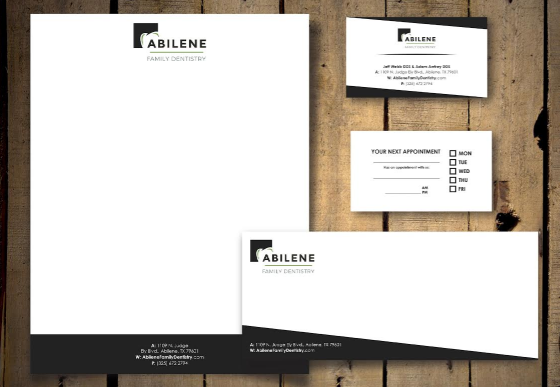
Abilene Family Dentistry
This practice owner wanted a classic, modest, and deliberate look to his visual branding, which is reflected in the simplicity of the black, white, and subtle pop of the green in his logo and stationery. His goal for his practice is to have a no-nonsense, approachable atmosphere, which is reflected in the simple, yet bold font and clever incorporation of a tooth in the logo. Key brand words are trustworthy, conservative, comfortable, genuine, and wellness.
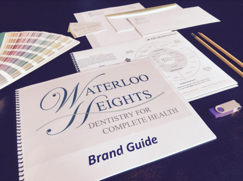
Waterloo Heights
The owners of Waterloo Heights wanted a logo that expressed values of respect, health, and trustworthiness which are relayed by tones of blue in the font. The curling capital letters lend a sense of prestige, which portrays dignity with a flourish. The swoop at the bottom of the logo makes viewers think of water, which nods to the practice name: Waterloo. Key brand words are supportive, comprehensive, venerable, wholesome, and health.
Could our Branding Package Benefit You?
Some PDA | Marketing Group clients come to us with a firmly established brand that works for them, and PDA bolsters their marketing efforts by reinforcing the existing brand. We invite clients outside that category to consider our Branding Package. Whether you’re trying to find a voice for a new business, want to revise your existing brand, or are ready for a full practice makeover, our Branding Package could provide the insight you need to articulate your vision for your practice.
Interested in a Complimentary Brand Review to see if your brand reflects how you want patients to view you? Send your logo, website URL, and practice name to us and mention that you want your Complimentary Brand Review. Or fill out the form below for a Complimentary Marketing Assessment and mention the “Brand Review”.
Have a great experience with PDA recently?
Download PDA Doctor Case Studies


