Episode 210 – Coloring Your Practice
“These are the colors that reflect them, and they use them in all sorts of fun ways. It’s not just on the walls, it’s on their scrubs, and their marketing collateral.” ~Regan Robertson
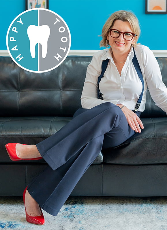
Welcome to the most colorful episode of Everyday Practices podcast ever! Dr. Maggie Augustyn of Happy Tooth in Elmhurst, IL, joins Regan Robertson in a discussion about the critical role of color in shaping the atmosphere, patient experience, and overall brand identity of dental practices.
Discover the science behind color psychology, from creating a welcoming entrance to setting the right tone in operatories (like painting your ceiling sky blue to alleviate fears of claustrophobia). Dr. Augustyn shares her personal experience with her childhood dentists’ unique color palette and Regan talks about the vibrant colors in a gynecologist’s office which convey empowerment to their patients.
For anyone who has ever been intrigued by the complexities of color and its profound influence on your office design, patient mood and perception, and your own well-being, this episode is a must-listen.
As you listen to this episode, pay close attention to the following:
- The role of Color Psychology in Dental Office Design and how it impacts your patients
- Authenticity in office design
- Discovering the balance between clean, minimalist aesthetics and more eclectic and message-driven designs (all while keeping patient comfort at the forefront)
EPISODE TRANSCRIPT
Regan 0:01
Hi, Doctor. Regan Robertson, CCO of Productive Dentist Academy here and I have a question for you. Are you finding it hard to get your team aligned to your vision, but you know, you deserve growth just like everybody else? That’s why we’ve created the PDA productivity workshop. For nearly 20 years PDA workshops have helped dentists just like you align their teams, get control of scheduling, and create productive practices that they love walking into every day. Just imagine how you will feel when you know your schedule is productive, your systems are humming, and your team is aligned to your vision. It’s simple, but it’s not necessarily easy. We can help visit productive dentists.com/workshop that’s productive dentist.com/workshop to secure your seats now.
Regan: 0:47
So you can set that tone right away. As soon as you see those windows, you can have window treatments done or the lighting or the signage that starting to set an expectation for me and by the time I walk in, I might not want to see that blue every single weaving way through my, my particular experience. It’s just to set a tone and move on to the next. Welcome to the Everyday Practices Podcast. I’m Regan Robertson, and my co-host Dr. Chad Johnson and I are on a mission to share the stories of everyday dentists who generate extraordinary results using practical proven methods you can take right into your own dental practice. If you’re ready to elevate patient care and produce results that are anything but ordinary. Buckle up and listen in.
Welcome to a very special episode of Everyday Practices podcast I am your host, Regan Robertson, my faithful and lovely co-host, Dr. Chad Johnson, is in practice today working on patients, imagine that. So we thank you Chad for your service and know how envious you are at knowing who our special guest is today. It is our own PDA faculty and practicing dentist, Dr. Maggie Augustine Maggie, welcome to our show.
Dr. Maggie Augustyn 2:11
Hello everyone.
Regan 2:14
Maggie, tell everyone where you’re calling in from.
Dr. Maggie Augustyn 2:18
I am hunkered down here in Lombard, Illinois, the western suburb of Chicago and I practice just a couple of towns over in Elmhurst, Illinois.
Regan 2:28
You know what’s funny is I got to visit Maggie and Elmhurst I have never been to Elmhurst in my life except for past June and one of the like, I guess you would call her an influencer, a very famous person on TikTok that I look at. She was in Elmhurst, like two weeks ago, yeah, she was highlighting some store and I just about jumped out of my skin and I’m like, “She also has been Elmhurst, I’ve been there, it’s a great community.”
Dr. Maggie Augustyn 2:54
It is, people tend to tend to like it, they tend to love it. There’s a lot of people that are moving from the city, young people with a little bit of money or a lot of bit of money. They’re establishing the roots, there’s, there’s a lot of kids in the area also growing up. So it’s a great community to serve.
Regan 3:11
It’s really fun to be part of something that’s growing and changing and you’ve got a gorgeous practice in Elmhurst with Florida ceiling windows in this historic building and so it was it was my honor to go over and meet your team, see what the practices is doing and specifically our topic for today is color and interior design and marketing and how we how we use color. You are an artist in your own right, besides dentistry, which I always call engineering and art come together, really with health but you have a lot of fun with color yourself. So I was wondering if you could tell our listeners a little bit about your journey with your practice and how you’ve used color throughout the years.
Dr. Maggie Augustyn 3:56
Yes, I love color. I love art. I studied art. When I was in college, I studied art history, whenever I’m in a larger town, whether it’s in the United States or abroad, I always go to the museums and I just really love to look at what people have created over the years and because we’re dentists and we pay so much attention to detail. You know, we have to be able to tell the difference between a one and a two or BL four when it comes to shade match and so that kind of detail-oriented color fascination, I think spreads into other areas of our lives and so when it came to branding the practice or choosing the color, it’s interesting because I really did not ask anybody’s influence or anybody’s opinion until I settled down on whatever it is that I wanted and I tend to make decisions quickly and I tend to make decisions quite solidly. So what So we’ve been in practice for almost 18 years and when we first to go over the practice, these were different times, it was 2006 and the two colors that I checked out see the logo that I made, I actually drew while I was a third-year dental student, and I just kept that logo and it’s been with me with us since it’s changed a little bit over the years and so the colors that I chose when we first opened our practice, and this is just what was popular back then we’re talking about almost two decades ago.
Regan 5:25
Did you choose the name also?
Dr. Maggie Augustyn 5:27
Yes. So
Regan 5:28
the logo and the name came from, another name came together, the name and the name is? happy
Dr. Maggie Augustyn 5:33
Happy Tooth, thank you, which sometimes gets confused for a pediatric office but nonetheless, and there’s other habitudes across the country as well but we’re happy to that alvers. So we chose this deep burgundy, deep red, burgundy, along with a gray and the reason why I chose burgundy at the time was I’d read that some of the luxury brands or people associate value, or quality. At that point, I read with burgundy and so I chose that and it looked really good. What year was this?
Dr. Maggie Augustyn
2006, 2007 I’d say
Regan 6:16
2006. I’ll do a little research. You keep talking. I’m wondering because it’s quite possible that you were seeing two on the runways or since you’re an art history major too, there could even, there’s all sorts of reasons why burgundy could have been popping up as a luxury. You know, color for you in your mind, it makes sense to me.
Dr. Maggie Augustyn 6:36
I can’t wait to see what you find out but yeah, even if you if you watch shows from that time, people were entirely different set of colors and yes, felt like burgundy lipsticks were far more popular than they are today, even if you think about that and so, at a certain time, you know, it was time, it was time for us to change our brand and because it started to look dated and then I started to think of red and blood and I didn’t want patients to enter the office looking at the red thing, possibly associating it with a button. So we decided to change and I’m going to give a shout out because there’s an orthodontist that’s a friend of mine that actually influenced partly the color that I chose. His office is called Oakley Brook Orthodontics and Dr. Neil Lauria, and he has always had the best website with the best color with the best branding and I would just sit there and I would go to his website, and I would fantasize that one day, my office or my website would look like that. And he had, I want to say like a mint ish green, and gray as his colors and that was kind of his branding and so I stole that a little bit. When I started to think about color. Now my favorite color was blue but one of the things that you told me when we were talking about choosing a new color is that this is not about me, it’s a little bit about me, it is a little bit about you a little bit about me, but it’s not, but it’s mostly about the patients. So, then, I found out if you can confirm that the most common color used in medically related facilities or logos is blue.
Regan 8:23
I will, I will confirm that I will see if I can find a study what I will tell you is blue is predominantly used in across all cultures for logo design, and the blues, the greens, the neutral beige is neutral grays, those, those are predominantly seen and that would be my my editorial assessment based off seeing 1000s of practices. So I would love to see a study though, I’m a stickler for studies, but editorially, that is by enlarge what we see and and 12 years of designing, you know, dental logos and working with the marketing agency, we do see a lot of those colors.
Dr. Maggie Augustyn 9:04
That that that that’s where I was headed with it but I didn’t want just blue, it seemed just not unique enough and just a little boring and a little cold and so we maybe talked a little bit about adding the green and to me green meant birth or like we talked about growth and so by adding a little bit of the green to the to the blue, we ended up with a color that is maybe close to turquoise, I would say yeah and then you inspired me to go and get a fan of colors, which I studied and sat with and you know I needed to I wanted to pick a gray that would complement that. So I did quite a bit of that and again without very much input from other people because I didn’t want that to check my decision. I I settled on Jamaica, I think it’s called Jamaica Bay is the color that, that ended up going used to the logo and then I reached out to you and we talked it through and both you and Sarah, as our marketing advisors decided that that would be a great color to go with but I will tell you so then we painted the walls. Yes and that on Monday when everybody came to work, everyone was afraid to tell me how much they hated it.
Regan 10:20
Oh no, they, it was such a shock to them.
Dr. Maggie Augustyn 10:25
I think so. Yes and because nothing was on the walls and our office has very high ceilings, you know? Yes, it does and so and it was I think overwhelming and it was it was it was bright in a different way and they just they were too so finally my partner said I think you should change that color I don’t think that colors right and I said just give it a minute. We have to put things on the walls it’s just gonna look totally different and then when we got the marketing pictures of the team, including my partner Ben, my partner did not like the blue in fact he said I don’t think he he still does not like the blue but after the marketing pictures came back everybody came around they said, “Wow, this is a really cool looking color,” and the website is early by the time this goes live is going to be up but today we have a party at my house and we’re unveiling the new website for happy to that Productive Dentist Academy and a team of marketing experts has designed for us
Regan 11:22
so you’ve had your you’ve had this the color up so so for all your all listeners they she has this, like I said beautiful historic building in Elmhurst and one predominant wall when you walk in it’s the wall that you will see when you first open the door. And it is this Jamaican Bay blue now with with art up on the walls and everything. Have you heard any feedback from patients yet ndicating a positive or negative or anything different?
Dr. Maggie Augustyn 11:50
We have not had a single patient say anything negative about it. In fact, most patients that have come in have been really pleasantly surprised at how things have changed. It just It even gives a different vibe, a different atmosphere, you’re more likely to be upbeat because that dark burgundy, I guess sucked the life out of you a little bit.
Regan 12 ;13
You think so?
Dr. Maggie Augustyn 12 ;15
I do it was it was just dark. It was sad.
Regan 12:20
Okay, there’s this there is this study that I just found from the National Library of Medicine and it’s from frontiers in psychology and it is the adaptive effects of seeing a green environment on psycho-physiological parameters when walking or running. So I know that’s a big mouthful to, to take in and I’ll be fair, I haven’t read the entire study yet, because I just found it but I was very excited because it was they really dove deep. They put them basically on treadmills and exposed them to screens that were either all red or all green and so the conclusion that from what I can tell anyway, so far is the perception, you aren’t like, your heart rate isn’t like, you’re not using it more oxygen and your heart rate isn’t necessarily beating faster, but your perception of seeing green makes it inherently calmer, versus the red and I have read before that when you are exposed to red or a darker red even it makes you more alert and it makes you more like it’s great if you’re going to proofread for example, I know we use a red pen when we’re often proofing things. So I know that it helps you to do that but you don’t want to be exposed to it for long periods of time and the color that you chose, like you said it has elements of blue and those warm elements as well. So it sits on the warmer tone of things which is quite stark compared to the red which I consider to be a blue red. So a little bit of a colder red when you walked in, so to the team who probably cares for consistency too, and and knowing what to be what’s predictable and expected, that would be a complete opposite, that would be a shift. So it would be quite a shock. One of the problems that I have seen in interior design is I know for myself, I tend to look at what I like and then I want to emulate that. So you mentioned that with your the doctor that use the mint green and the gray. I’m the same way and I think most of us are we see what we like and we want to emulate that. There was a trend for a long time I saw where everybody wanted to look like an Apple store where a Macintosh were sold model the yeah and so they they what they remember of it was the white, everything was white, everything was cleaned, the boxes were white, everything was sleek, and they so they wanted their offices to be that same modern feel all white and if you’re not working with an interior designer that understands balance, and listeners, this is my one big takeaway for you. If you don’t understand the balance that can end up creating an environment that can cause headaches. It can come off as too sterile or like you were saying Maggie, cold. Like the blues that you would associate with the other logos that you were seeing were looking cold to you and that’s because our brains are constantly trying to create an equilibrium, we want to bring a balance when we are using color. So if you really go and look at those Apple Stores, what you’ll see is that yes, they were white, they also had elements like warm wood tables, or you’ll notice that they had the screens up with like green, noticeable, they kept Windows spaces open. So as you’re walking through your own practice, pay attention to what’s outside the windows, because people are seeing that the lighting, the lighting, the lighting, the lighting times 10, the color you choose, you know, might look fantastic until it gets to be 4:30 on a winter’s night and you turn on the lights, and then it can dramatically change the color of the walls. So all of those elements should be tested for and that balance. Like you said, bringing in greenery would be very helpful as well. There’s a fantastic article, I’m going to put in our show notes, this article from Leatrice Eiseman, who, she is the leading color authority. And she was the executive director for Pantone Color Institute for a long time I’ve studied under her and there’s a fantastic article about creating after images in our mind and getting that balance.
Dr. Maggie Augustyn 16:26
This is so incredibly interesting, because even as you’re speaking and I’m thinking about the red and the blue, first of all the fact that you said Stark, and I caught it, I said upbeat but I think Stark is a better description of it. At our office, we are really positive and we’re really upbeat and it’s not that we have large personalities, but we just like to laugh and have fun and get along and it felt that like that red was not communicating the atmosphere in which we wanted to provide care to our patients. It just, it didn’t translate into who we are and now with the blue, blue, green, or Jamaican Bay, that upbeat feels like it’s much better translated in throughout the rest of the office, but it was interesting, because even you know, when we talked, you don’t want to take that stark blue and put it everywhere.
Regan 17:26
No, no, no, I was going to I was going to explain, you know, for you listing in your own practice, as well think about what I did with Maggie’s office was I started from the sidewalk, I actually started from across the street and I just let my eye naturally fall to two different locations and I observed from a completely naked perspective, basically and so as I walked across the street, I paid attention to what was outside of your practice, what was on the building itself, what was on the windows, every little thing leads up to the experience and what I expect at a moment’s time is going to change with me as I go throughout that appointment. So you can set that tone right away as soon as you see those windows, you can have window treatments done or the lighting or the signage that’s starting to set an expectation for me and by the time I walk in, I might not want to see that blue, every single weaving way through my particular experience. It’s just to set a tone and move on to the next and I’ve often recommended for people who have favorite colors, like I had a really great friend whose favorite color is chartreuse, and chartreuse can have a very negative connotation to some
Dr. Maggie Augustyn 18:47
people look up what this looks like chartreuse, chartreuse.
Regan 18:49
It’s it’s a pretty loud color.
Dr. Maggie Augustyn 18:53
Oh, wow. Yes, that’s a lime green family of lime green. I would say no.
Regan 18:58
Fun fact. I had a Do you remember the car brand Saturn? Yes, I had a chartreuse Saturn.
Dr. Maggie Augustyn 19:08
I had a wasabi-colored beetle.
Regan 19:13
Oh, oh, I like that. That sounds a lot more fun than a chartreuse that.
Dr. Maggie Augustyn 19:18
That is an obnoxious color. Well, that’s my opinion, right? That’s my opinion.
Regan 19:24
Yeah, and some and so with any color, somebody’s going to have either a neutral or a positive or a negative connotation. So if there’s a color that tends to have more negative connotations, or it’s a more complex color, perhaps that might come off as a little bit confusing to people, like shades of purple can come off as mystical at times and you might not want that but however you might absolutely love that color. That’s when I recommend you know, make sure that you put that in places where you can see that your patients don’t need to be in your office. So if you desire I was concerned I remember you know, we we’re still early on in our relationship, Maggie when I made the recommendation, like if we’re going to change the colors, you know, I didn’t know how you felt about the red. And I thought maybe you need red like that is a very important color to you and so stripping that away could strip away your identity. So, if that was the case, how do we incorporate that back in? I noticed, for example, on I think it was your birthday on Facebook, they your team like decorated the whole O’s gorgeous. So if you go to happy tooth Elmhurst on Facebook, and look, you’ll see the team decorated for her and I believe if I remember, right, it was like roses like red roses, balloons. It was all red and red is it created the most beautiful balance with that Jamaican Bay. Yeah, and I thought, “What an interesting story that this is telling right here. This is really, really interesting to me, because it created the balance that was there with that read before,” and I thought, “You know, maybe red is one of Maggie’s favorite colors or a color that means something to her.” So you can still have that in your personal office space, I just don’t recommend taking chartreuse and painting it down a hallway with fluorescent lights.
Dr. Maggie Augustyn 21:11
That would be that would be well it in the world that I live in and the way that my mind works, that would be hard for me to walk through. And I remember learning from you, when we were discussing colors is exactly what you talked about the fact that you may like one color, or we may dislike one color, let’s say, “Well, my favorite color is not yellow, or orange.” Now, if you put me in it in a room that I worked in, that was yellow, and orange, what is that going to do to the way that I work? Right? It’s just going to be distracting, and it’s not going to put me at ease or in flow. So those are also some considerations. So if you think color blue would be appropriate to your practice, but just like you said, but you absolutely dislike that color and disengaged from it, what is that going to do to the way that you that you work? And so you either put it in a different place where you put your favorite color in a different place to help align yourself like in your private office, right? Yeah, or you use the color of your practice in limited places so that you’re not as affected by but it’s interesting Regan and that just goes back to it how little we know about the human mind and just how much we are affected by play
Regan 22:29
powerfully. You know, in the in the it’s called the color answer book by by Leah truss. If we use this, if we use video, I don’t think we’re gonna use video for this podcast but if we use video that the color answer book is really good and it has color recommendations, based on certain feelings that you have and, and when you think about colors that you like, or dislike, and you know how you mentioned, thinking about it from the patient’s perspective I really loved here it says. It says, “If you’ve if you’re suffering or fearful of claustrophobia, to paint the ceiling, a sky blue,” and I thought that was fascinating, because our patients are looking up, they’re always looking up, they’re gonna have to look up as soon as they lean back in that. And now in your practice, the front part of your practice has this amazing historical ceiling, it’s like silver, if I recall, yes, like a tile or something, it’s just gorgeous but to reproduce that in the operatories would be enormously expensive, probably not very conducive to things and quite frankly, light might not reflects the light in the right way either. So that would be an area where you could take that Jamaican Bay and almost bring it in not paint Jamaican Bay on the ceiling, but you could incorporate little sky blue pops and cause that that breathing in that sensation to be more relaxed in that in that environment and when you talk to yellows, and oranges, and absolutely not liking that color, not only will you be displeased in that space, I think you will be hungry and looking for balance. So you will be looking for the complementary color of that to try to balance it out. And that, you know, I think the goal is to help you focus as a clinician and stay in an area where your balance is restored and also keep that that patient as calm as you can, which is why we pick often softer, softer shades. Yeah,
Dr. Maggie Augustyn 24:26
I find that to be very, very fascinating and there’s an exercise that you and I did before the podcast, which I think you should share in the podcast notes which I’m also going to share in the article that I’m writing about this is you’re looking at a screen of of yellow, a yellow part of a flag for 30 seconds and then you move your eyes to the white and you’re going to see a different color and it was like magic and it’s the same thing you say the sun. You look at the sun for too long and you look over and you see the image of the sun in a different color and that’s that balancing that you’re talking about? Absolutely. It needs to have that. Yes,
Regan 25:05
Yes, we will put the image in the show notes for you to look at because yes, that’s it’s a perfect example of desiring that balance, and you cannot get away from it. I mean, it’s just nature. So color does play an important role in it and I highly advise if you are going through a remodel, because modern design is just, I think we will end up going back into maximalism sometime but right now, you know, modernism sleek and clean is still king, from what I’ve seen in a lot of practices, and the overuse of white is a, a dangerous game to play, I think, I think making sure that you have that balance is there and the practices that do it right, I would say I see the sleek use of white, maybe in the cabinet doors or maybe on the walls, but then I will see a really warm, wooden welcome reception desk, or I’ll see a warm coffee table or I’ll see the use of plants. So but if you’re in a city that has a lot of gray, outside, if you’re near skyscrapers and whatnot, you always want to have that balance either on monitors, lighting, nature with the plants have the artwork. So always important to get that balance in there and not over-dial it. On your new website, speaking of your new website, I have to share with you why I love your gray so very, very much because you have the Jamaican Bay, and then you also have this gray, your office has this beautiful warm wood floors, throughout that I absolutely love and the gray to me actually creates that balance and that homeostasis effect because it’s cooler. So you’ve got Jamaican Bay, which is a warm blue, and you’ve got your beautiful warm, rich floors and now you’ve got that gray, which is a beautiful neutral, and it balances it out. It’s not overly warm.
Dr. Maggie Augustyn 26:53
Again, I’m just in disbelief at how much goes into this because you could go to some of these, you know, crowd-sourcing websites where you can pay $150 to have a logo designed, right? But what are people going to think, what is going to enter their mind as they’re looking at this logo that someone designed for you not really knowing who you are, what you stand for what you like, how you vibe? You know, that’s an interesting dilemma and I strongly recommend working with an expert, like, like Regan to, to, if you could get her to yourself for a few minutes to kind of look at that and to think about it because color communicates so much. But do you have any favorite stories about office design at all? I’m sure you do and how color played a role or any of that?
Regan 27:50
I do I do. I’ll tell you at the last PDA workshop, I did get to see I was asked to my advice on a logo design and and the logo was okay, the logo was fine. The colors were really interesting and I asked what the reasoning was behind the choice of the color and the response like I was I did not choose the colors, the designer chose the colors for me, I just went with it and I was so amazed by that because of the you know, there was no consideration of materials that are already out there. The website, you know, maybe the physical office building space, the lack of cohesion, the lack of even asking, you know, what colors would you like, like even starting at the at the base was really fascinating to me and it did showcase to me that, you know, color is not for everyone. I love how you talked about the different shades of of teeth, because that, by the way is one of the sexiest things ever to get that all matching that is hard and that is oh yeah, that’s color matching. So that’s another realm entirely. But you know, I wouldn’t go to a dentist, I wouldn’t go to $150 dentist, let me put it to you that way and that would just give me a result and not really asked my input or asked me what type of smile I was I was looking to receive it might functionally work but maybe not make me happiest in the long term and that’s a lot of the ways I think about how I approach every expert is I like to go to someone who is passionate about a topic and has studied the topic because there’s a lot that goes that goes underneath the scenes that we don’t think about and I know as a dentist you can definitely relate to that. So my, my favorite, my favorite office design is actually why I have to one I had nothing to do with I grew up in it. It was my childhood dentist. I started seeing him when I was eight. I missed him to this day. He was a phenomenal dentist absolute miracle. In fact, I chipped my front tooth when I was pregnant with my daughter. I don’t remember what tooth it was and it’s a composite and I have had I’ve even asked Chad, “Can you can you tell me which one it is?” And he can’t tell me I don’t know which tooth it was. It is so perfect. So his office was gray, and then mov and purple. And even for a man to I find that to be a really nice complex color, he applied it beautifully. He brought in blown glass, local art, we have an emergence festival here every year. My favorite thing though, and how he brought balanced to these shades, which it was, it was a warmer purple mixed with kind of a cooler gray. So the homeostasis was there. But he was big on mission trips and travel. So in each operatory were different photographs from his mission trips with very vibrantly dressed people and so it brought in this artistic pop of color, and it humanized the space for me as a child. So it was very humanizing and, and the team, of course, was wonderful. So that design, I loved it because he’s he taught me to be brave, and not just go a traditional route just to go a traditional route, but I felt his personality, I felt his authenticity present in the practice. So it wasn’t a stock photography hanging up on the wall and it wasn’t even just before and afters of patients, which I highly recommend. I think those are phenomenal, but it brought a bit of himself into it. I also thought he was very brave with the color choice as well. So that, that is one of my favorite color stories. My second is Chin GYN, look up Chin GYN. It’s a gynecologist office, if you listen to my podcast, you’ve heard me talk about them before. Fun, amazing design. They have a theme of female empowerment and they hire a graphic designer who designs all of the art that’s on the wall. It’s all these famous women. So you see it everywhere. Their colors are blue, like a bright blue, a bright, fresh green, and then in smiling cartoon uterus, which is pink. So these are their colors, and they reflect them in all sorts of really, really fun ways around the practice. So it’s not just on the walls, it’s in their scrubs. It’s in their marketing collateral. They bring in greenery, they have a selfie wall that has like greenery on it and what is it like a blown glass lighting, so like neon lighting, they just really know how to have a lot of fun with their use of color. So they they shout it loud and they and they shout it proud and they’re good at achieving that balance too. Even though they are I would not call them sleek and modern and minimalist design, I would definitely call it more vibrant and more eclectic, almost even. So those are those are two examples of practices. You can have a sleek, clean design and still bring your authentic self or you can have a very eclectic design with a message to share, both actually had messages. And I felt like they were they were both really well represented.
Dr. Maggie Augustyn 32:45
Yeah, that’s that. That’s fantastic. I’m looking at the Chin GYN website and I see exactly what you’re talking about and that’s ch i n n gyn.com. Yeah, just not not enough color. Right and me, we’ve also talked about why certain people are attracted to certain color and how they can play off the chakras and maybe that’s, that’s for another podcast to be talked about. Because I find that also to be really interesting to lie. You know, at certain times during our lives, we like or are attracted to different colors.
Regan 33:25
And I’ve got stories around that. Let’s we will hold this off for podcast number two. Maggie, thank you so much for your time this morning. That was it’s been fantastic.
Dr. Maggie Augustyn 33:35
Thank you. Thank you very much and I look forward to talking about color more.
Regan 33:40
Before we go really quickly, what is your website so our listeners can check it? Oh, yes.
Dr. Maggie Augustyn 33:44
It’s myhappytooth.com.
Regan 33:47
myhappytooth.com. Thank you so much.
Dr. Maggie Augustyn 33:50
You’re welcome. Thank you see you next time.
Regan 33:55
Thank you for listening to another episode of Everyday Practices podcast. Chad and I are here every week. Thanks to our community of listeners just like you and we’d love your help. It would mean the world if you can help spread the word by sharing this episode with a fellow dentist and leave us a review on iTunes or Spotify. Do you have an extraordinary story you’d like to share or feedback on how we can make this podcast even more awesome? Drop us an email at podcast@productivedentist.com and don’t forget to check out our other podcasts from Productive Dentist Academy at productivedentist.com/podcasts See you next week.
Have a great experience with PDA recently?
Download PDA Doctor Case Studies
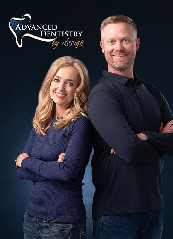
Drs. Clint & Kelly Euse
PDA Members Since 2008
Advanced Dentistry by Design
Carson City, NV